Buying foundation in the wrong undertone is the most common — and most expensive — makeup mistake people make. The wrong undertone makes your skin look ashen, orange, grey, or just slightly off in a way you can’t quite identify. The right undertone makes you look exactly like yourself, only refreshed.
Most consumer methods of finding undertone are unreliable. The “look at your veins” test gives mixed results for most people. The jewellery test (gold vs silver) is more accurate but still feels subjective. Professional makeup artists use a more rigorous method that takes about 3 minutes.
Here’s how to do it.
What skin undertone actually means
First, distinguish between two terms that get confused:
Skin tone is the surface colour of your skin — fair, light, medium, tan, deep. This changes with sun exposure, can be different on different parts of your body, and shifts seasonally.
Skin undertone is the underlying hue that doesn’t change. It’s beneath the surface colour. There are three categories:
- Cool undertone: pink, red, or bluish hue underneath
- Warm undertone: golden, yellow, or peachy hue underneath
- Neutral undertone: a balanced mix of cool and warm
Your undertone never changes. Your surface tone changes constantly. Foundation matching is mostly about undertone, not surface tone.
The 3-minute professional test
This method combines three checks that working artists use. Doing all three reduces uncertainty more than any single test.
Test 1: The white paper test (1 minute)
You need a clean piece of white paper (printer paper works) and natural daylight near a window. Don’t do this under indoor lighting — it’s yellow-toned and skews results.
1. Stand near a window with daylight hitting your face
2. Hold the white paper next to your face, close to your jaw
3. Look at your reflection in a mirror
4. Observe how your skin appears AGAINST the white
Reading the result:
- Skin looks slightly pink, red, or blue-tinged against the white → cool undertone
- Skin looks slightly yellow, golden, or peachy against the white → warm undertone
- Skin looks roughly balanced — neither distinctly pink nor yellow → neutral undertone
This single test is usually reliable enough. The next two tests confirm it.
Test 2: The neutral colours test (1 minute)
Find two items in your wardrobe: pure white (not cream, not off-white) and pure black (not navy, not charcoal).
1. Hold the white shirt under your chin, see how your skin appears
2. Then hold the black shirt under your chin, see how your skin appears
Reading the result:
- White makes you look fresh, black makes you look harsh → cool undertone (cool tones favour you over neutrals)
- White makes you look washed-out, black makes you look fine → warm undertone
- Both look fine → neutral undertone
Working makeup artists routinely use this test on clients during consultations. It’s particularly useful for confirming whether someone is genuinely neutral or just on the boundary.
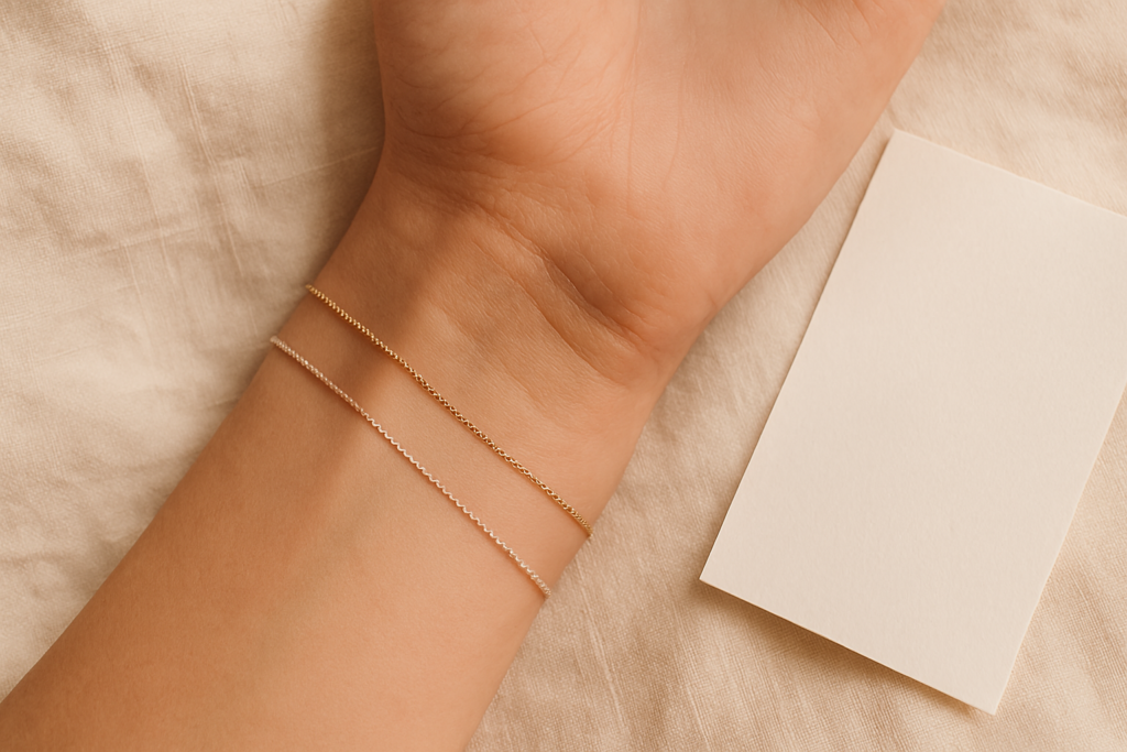
Test 3: The metals test (1 minute)
Try on a gold piece of jewellery, then a silver piece. Look at your face with each.
- Silver flatters you, gold looks slightly off → cool undertone
- Gold flatters you, silver looks slightly off → warm undertone
- Both work equally → neutral undertone
This test gets unfairly dismissed because most people own jewellery in only one metal. But if you have access to both, it’s reliable.
Reading the combined results
The three tests should align in roughly 80% of cases. If two out of three indicate one undertone and the third disagrees, trust the majority.
If all three give different answers (rare), you’re probably neutral.
Learn this from Paula Callan
30 years training celebrity makeup artists. 7 hours of video tutorials, lifetime access, 60-day money-back guarantee. €149.
How to use your undertone for foundation shopping
Once you know your undertone, foundation shopping gets dramatically easier. Foundation labels indicate undertone in a few ways:
The letter code:
- “C” or “Cool” = cool undertone
- “W” or “Warm” = warm undertone
- “N” or “Neutral” = neutral undertone
The shade name (less reliable):
- Names with “porcelain,” “rose,” “ivory” usually = cool
- Names with “beige,” “honey,” “golden,” “sand” usually = warm
- Names with “buff,” “cream,” “vanilla” usually = neutral
Some brands use numbers (avoid these unless you can test):
- These usually don’t indicate undertone, only depth
For depth, you still need to match physically to your jaw. But for undertone, knowing yours in advance eliminates 80% of the shopping confusion.
The professional shade-match technique
Even with the right undertone identified, getting the exact match takes one more step. Working artists use this method when shade-matching at a counter:
1. Cleanse the area where you’ll test. Even residual moisturiser shifts colour slightly.
2. Apply a small dot of foundation to the centre of your jaw — not your hand, not your cheek. The jaw is where face meets neck, which is the colour boundary you most want to disappear.
3. Blend it out completely with a finger or brush.
4. Walk outside or to a window with natural light. Counter lighting is yellow-tinged and lies about colour.
5. The right shade will become invisible. You won’t see where you applied it. If you can see a line or a patch, the shade is wrong.
6. Test 2-3 shades at once, in stripes along the jaw. Comparing side-by-side is more accurate than testing them one at a time.
Why this matters for working artists
If you’re aspiring to do paid client work, undertone reading becomes a daily skill. You’ll match foundation to dozens of different clients, in different lighting, on different timelines. The ability to read undertone in 60 seconds — by looking at the inner wrist, the jaw, and the chest — is part of what separates working artists from hobbyists.
The reading process for a client:
1. Quick visual scan under natural light if available
2. The inner wrist check (similar to the white paper test, but using your own skin as comparison)
3. Confirm by testing foundation on the jaw during application
Practice on yourself, then on friends and family. By the time you’re working with clients, the reading should be near-instant.
What about deeper skin tones?
The undertone system above works across all skin depths, but with one nuance worth flagging: very deep skin tones often have undertones that lean to red, orange, or olive rather than the classic cool/warm/neutral. Working with deeper skin tones, you may also encounter:
- Olive undertones — green-leaning, common in Mediterranean, Middle Eastern, and South Asian skin
- Red undertones — common in Caribbean and African skin
- Strong warm undertones — common in African and South Asian skin
Major foundation brands historically did this badly. The newer Black-owned brands (Fenty, Pat McGrath, Uoma) do it much better, with more nuanced undertone options at deeper shades. If you have a deeper skin tone and you’ve struggled with foundation matching from mainstream brands, these brands are worth trying first.
Get the Becoming a Makeup Artist guide
The honest career roadmap — training options, realistic timelines, first-kit budgets, and how to know if this path is right for you.
Quick reference
Print this and keep it for foundation shopping:
Cool undertone signals: pink/red/blue under skin against white, silver jewellery flatters, white shirts look fresh, black shirts look harsh
Warm undertone signals: yellow/golden/peach under skin against white, gold jewellery flatters, white shirts look washed-out, black shirts look fine
Neutral undertone signals: mixed signals across all three tests, both metals look fine, both white and black work
Best practice: Always match foundation to your jaw, in natural daylight, and test 2-3 shades at once.
The bottom line
Skin undertone is the invisible variable that determines whether your foundation looks natural or “off.” Most people guess at their undertone or use one unreliable test. Working artists use a combination of three checks that reach roughly 95% accuracy in under three minutes.
Knowing your undertone, with confidence, makes every future foundation purchase easier. It also makes blush, lipstick, and clothing decisions easier — the colours that flatter you all share your undertone.
This is the kind of foundational skill the Paula Callan Masterclass teaches in depth, with practical demonstration on multiple skin tones and undertones. For aspiring artists, it’s one of the most important early skills to nail. For consumers, it’s the difference between buying foundation that works and buying foundation that disappoints.